
The collective Plus Plus Plus Égal is a creative structure founded in 2014 by Camille Trimardeau and Marjorie Ober. This structure is intended to be evolutive because it wishes to welcome "guests" on various projects in order to establish a collaborative climate. Initially designed to create an emulation within the art school attended (École Supérieure d'Art et Design Le Havre-Rouen), notably through research projects designed and carried out by several people, the collective has since approached the commission with references such as the ESADHaR of Le Havre, the sound designer Coralie Diatkine and theorist and teacher Vanina Pinter.
"Convinced that the addition of ideas, personalities, hands and materials is a philosophy of the future, we like to surround ourselves with unique skills in order to extend the field of possibilities". Plus Plus Plus Égal affirms a willingness to combine knowledge and practices in the configuration of the multiple, of the group. Thus, the interest lies both in the plural forms that the work can take and in the interaction between people of similar creative sensibilities, these two aspects feeding the breath of the participants at an individual and collective level.
If our main field of action remains graphic design, we are committed to showing all its diversity: interactive design (department at the origin of the collaboration), book and printed object, web, installation, type design, etc. The relationship to interactivity, apart from the immersive possibilities and the potential for exchange with the spectator - matured during the studies - is essential to us today in the shift it raises between analog and digital. By considering the graphic object as an interface, it is a question of exploring together the limits and tensions between the paper and the screen, from the physical device to the simple visual reference. For us, this axis is decisive in its propensity to open up the stakes and the panorama of graphic design, a position that has been with us since our beginnings.
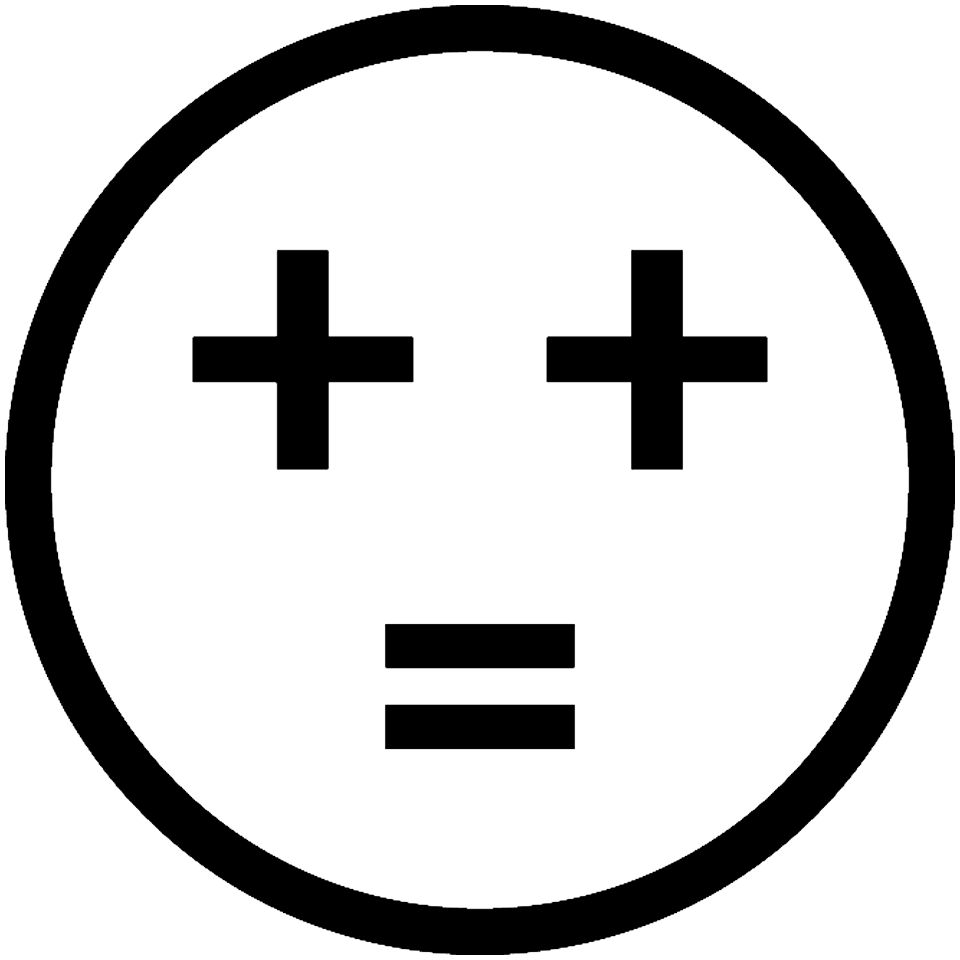
The Plus Plus Equal designation is a simple signature that can induce typographical management (written in full spelling), such as being quickly scribbled at the corner of a support in a spontaneous gesture (++=). At the origin of this choice of name, the irony on the designers' gimmick which consists in naming his studio "untel + untel". More seriously, this semblance of formula, this equation, can solidarize an infinite series of names, so as to signify the idea that a name plus a name, plus a name, etc. equals the collective. In the same way, names could be replaced by words, relating to techniques or materials, and it is then stages of realization that lead to a result. Added to this is a nod to computer logic, which is found in the mathematical operators "+" and "=". The expression of our affection and nostalgia for cyberculture and its aesthetics.